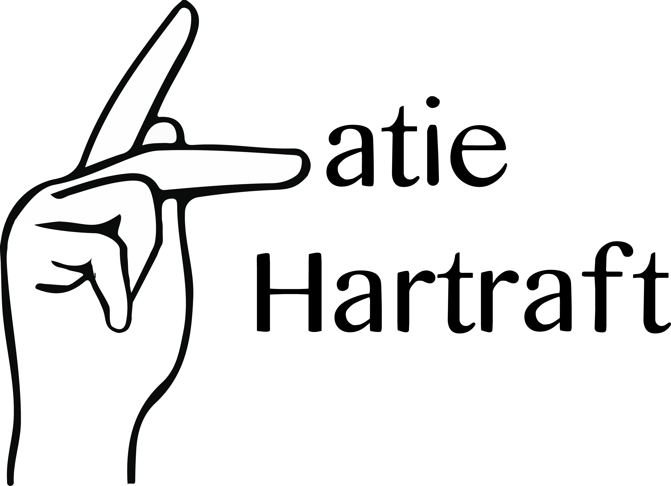

Project 2, making a logo for our blog!
The original font I used was Sinhala MN, which I tweaked to make more rounded and hand-drawn looking.
I decided to use the ASL sign for “K” because I love the language and the Deaf community. Earlier this year I had been thinking I would become an interpreter, but now I’m not as sure. Too many directions I can go!! I’m not having a crisis at ALL. I wanted to make something better, namely with the gradient on the H, but I ran out of time (and I knew I could spend unhealthy amounts of time on this, but I was trying to not overdo it). Here is the colored version, using a deep green I really like:
And here is a black and white version:

I initially made a logo with my entire name, editing the font to better fit what I liked. I feel like this is better for a main logo on my blog, while the previous two could be my site icon. This one is probably my favorite out of all of them, even considering all the time I spent on the other two.