

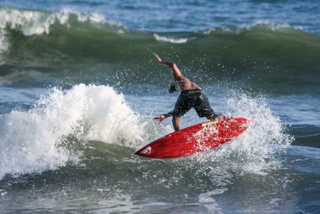
For my first picture, I used the “vivid” preset to start my editing. I then edited the contrast and desaturated a little bit to make the surf board a little less vibrant. I also took down the temperature to make the water more blue. Overall, I think this made the photo look more lifelike and realistic.
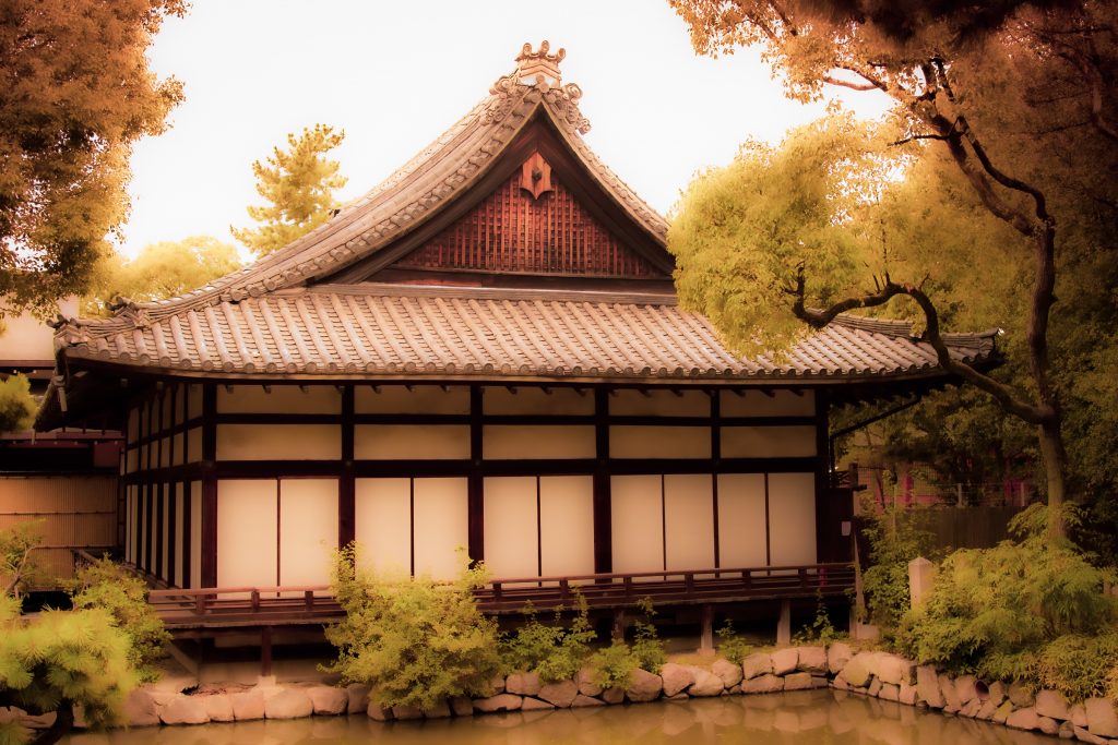
For this picture, I wanted to make the image look like a still from a movie. I first used the preset “turquoise and red” and from there I edited the tint, exposure, clarity, dehaze, and texture to make the picture blurrier and more like a painting. Lastly, I added graduated filters to alter the tops of the trees and make them more dramatic.